Please follow these guidelines when mentioning Abroad in any marketing or communication materials, including websites, social media, articles, printed assets, or promotional campaigns. They’re here to help you represent Abroad clearly, consistently, and in a way that reflects the values behind our mission.
Abroad Logo
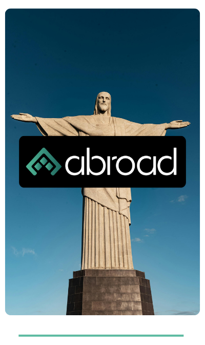
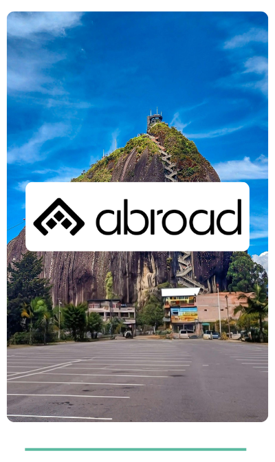
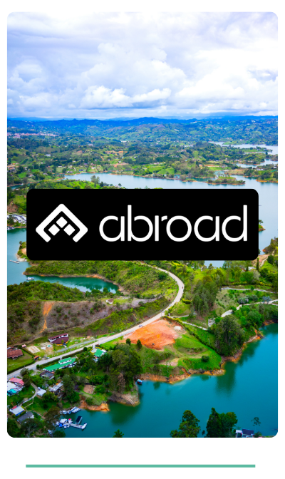
The Abroad logo is a core element of our visual identity. Its clean typography and distinctive symbol represent our mission: to simplify global financial access and connect people across borders.Use these official versions depending on the context, whether on light or dark backgrounds, in digital or print media, or over real-world imagery. Always respect the clear space around the logo and never alter its proportions or colors.Each variation is crafted to ensure visibility and brand consistency across every application.
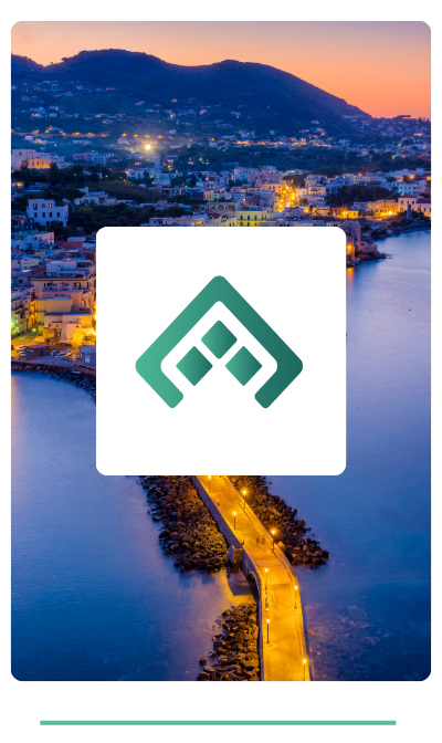
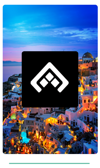
The Abroad isotype is a core visual element of our brand system. Its geometric, clean and distinctive design allows it to stand alone in contexts where the full logo isn’t required, such as digital interfaces, icons, branded products, or promotional content. Each version is optimized for clarity, flexibility, and visual consistency across all formats. Always use the official files provided and do not alter the shape, colors, proportions, or orientation in any way.
Abroad’s color palette is built on a harmonious and functional foundation, designed to provide versatility and cohesion across all visual environments. The main gradient serves as a distinctive element for backgrounds and transitions, while the solid green tones bring identity and hierarchy to key components like buttons, charts, and icons. Black acts as an accent color, enhancing readability and creating contrast where needed. This combination allows for a flexible, modern
.png)


.svg)


